
When we watch a blockbuster movie, we seldom consider the hours that went into creating the feel and look of the film. The colors are just right. And they work to advance the narrative.
Yet the work is subtle; we barely notice any change in tonality or hue throughout the film.
This magic is known as color grading and is part of every film and video out there. From the biggest movies like The Matrix to small YouTube videos, color grading is an important step in every video storytelling process.
Continue reading to learn more about what color grading is and why color grading is important.
What is color grading?
In a way, color grading can be considered a form of color correction. However, the act of color grading goes much further than balancing color. For this fact, color grading is different than color correcting. Color grading goes beyond the color balancing done in the correction phase by baking into the footage a certain look or feel.
It is one of the final steps in the filmmaking process. The director and cinematographer often have a huge role in working with the colorist to achieve a certain look to the final footage.
Color grading also includes adjusting the white balance throughout the individual scenes; increasing or decreasing the saturation; adjusting the blacks and whites.
This is done to turn often flat, dull footage created in RAW or Log format to pop and look aesthetically pleasing.
Positive effects of good color grading
Color grading is essential to any video. It is completed by the colorist, or color grader. There are entire businesses dedicated to this process. And even color grading software specifically for adjusting the tones of video footage.
Why is color grading important? Well, one of the most positive effects of good color grading is creating a balanced feel and tone throughout an entire film. There are many genres of film that are improved through a specific tonality throughout the movie.
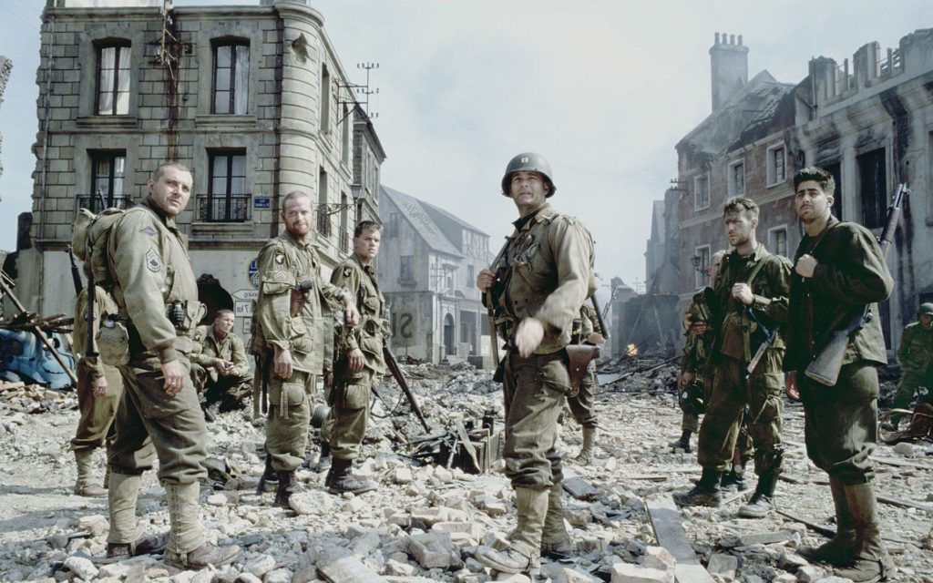
For example, Saving Private Ryan is definitive of the bleach bypass effect. The bleach bypass effect is a carryover from the film days. It is the process of skipping a step in color processing. It produces a contrasty and desaturated image.
A properly color-graded video should be technically clean, but also be in creative harmony with the overall feel of the video. Romantic comedies are a perfect example. The color is typically warmer throughout and skin tones are impeccably accurate. Furthermore, pops of color will be sprinkled throughout the film through set design.
Color grading is essential to any filmmaking or video process. Knowing how to achieve a certain look is a mixture of skill, color theory, and practice.
Of course, too much color grading can lead to negative color grading effects.
Negative effects of color grading gone wrong
When colors are pushed too far in the grading process artifacts become apparent and the film video quality slips from professional to amateur. Avoiding a few things will help you create professionally graded footage without too much work.
Without proper exposure in your footage, your grading will be challenging. It also may not be salvageable. This is known as the starting point in color grading. If it is good, then color grading will be much easier.
Weird colors will look odd and unnatural. Without a grasp of color theory, you may be left with a color grade that looks unprofessional. Colorists avoid this through a solid understanding of color and working on the color ‘feel’ from inception to color lock (the final product).
Skin tones are particularly sensitive to color grading. If you are not careful you can turn someone into a ghost by desaturating the skin tones. Conversely, you can make the skin far too orange.
This is just the tip of the iceberg, but too much color grading or reliance on a Look Up Table, also known as a LUT, can make your footage go from potentially stellar to subpar.
Check out these color grading YouTube tutorials for more help.
Color Grading Concepts to Consider
- Think of color grading as the video equivalent of post-processing a RAW image. It is best to use a Raw or Log format. The image out of the camera will be flat, dull, and desaturated. Through the color grading process, the colorist can pull out the data and boost the colors.
- Color grading is a solid way to create consistency throughout the length of the video. Oftentimes videos are created on different cameras. And the out-of-camera look may not be the same across the footage. By color matching each clip to the previous one, the look of the video from start to finish will be visually cohesive. In most softwares, there are matching panels that facilitate this process.
- A director often has a vision for the overall look, tone, and feel of the film. It is conceived early in filmmaking. After filming, color grading helps bake this color conception into the film.
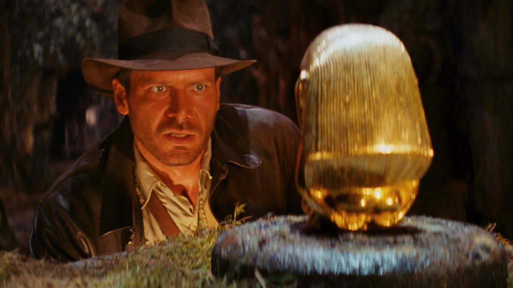
- Concepts can be blended alongside color grading. Color choices and grading can be purposeful in order to advance a thematic concept of the film. For example, we all associate red with danger. It is baked into our genetics. We can see this play out in the color grading of The Raiders of the Lost Ark.
- Color grading helps you achieve the overall mood of the video. If it is a food commercial, you will most often have a slightly oversaturated and bright color grade that highlights the food. If it is a documentary film, the colors may be slightly subdued and voyeuristic to focus on the story.
Examples of Color Grading Successes
Once you have read through this article and want to improve your skills as a colorist, create some footage and try to replicate the color grade of the below films. These examples do colors the right way and help answer the question “why is color grading important?“.
Transformers – 2007
This movie is an action thriller and is the perfect example to showcase orange and teal grading. Orange and teal are both complimentary colors, meaning they are opposite on the color wheel. Complimentary colors are also pleasing to the eye and often draw the viewer in.

Another reason these two colors work together is by providing depth. This is accomplished because they have the highest contrast between exposures. So orange is the color of the highlights and teal that of the shadows. Here is a video highlighting the orange and teal look in a video.
The Matrix – 1999
This film pushes to the very edge of color grading. To achieve this, the creative team boosted the greens beyond our normal perception. This only works because of the alt-reality narrative of the film. If you watch it, you will notice that even the skin tones take on a slight green cast.
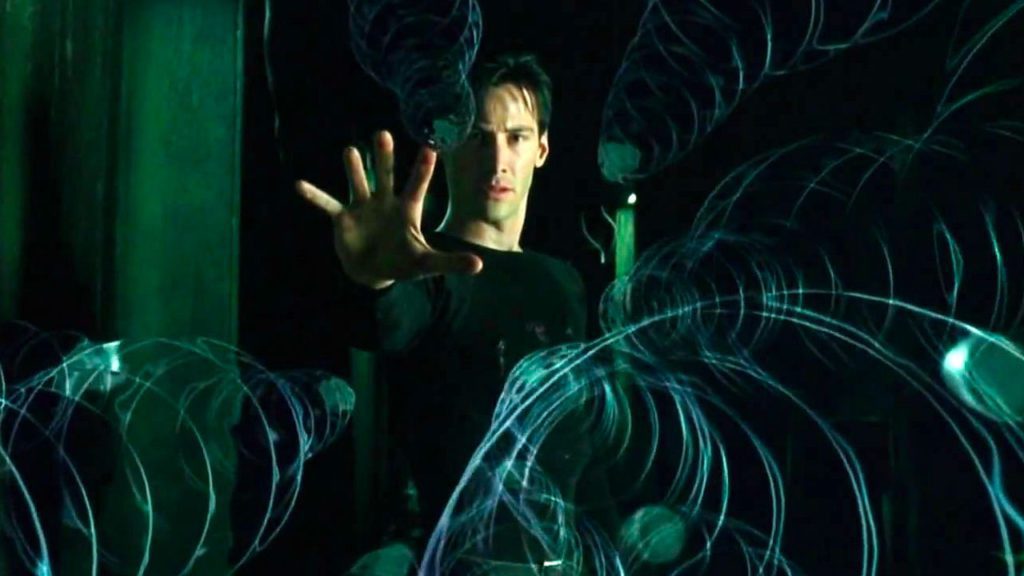
You would not find this level of color grading in a romantic comedy or even a thriller. But in mystery or science fiction film, adding a subtle green cast is the perfect way to combine color grading and concept.
Another way to use an overall color cast is to have the color cast appear in certain aspects of the film. Perhaps a dream world requires a softer, desaturated color grade. Or even a flashback. Color grading is a great creative tool in video storytelling.
Moonrise Kingdom – 2012
Typical of Wes Anderson’s style, Moonrise Kingdom is a great case study in the importance of color grading. The overall color grade of this film is monochromatic. Meaning the colors of each scene are closer to each other on the color wheel.
This color grade helps augment the childlike nature and simple-heartedness of the characters in the film. Another great example of blending concepts and color grading.
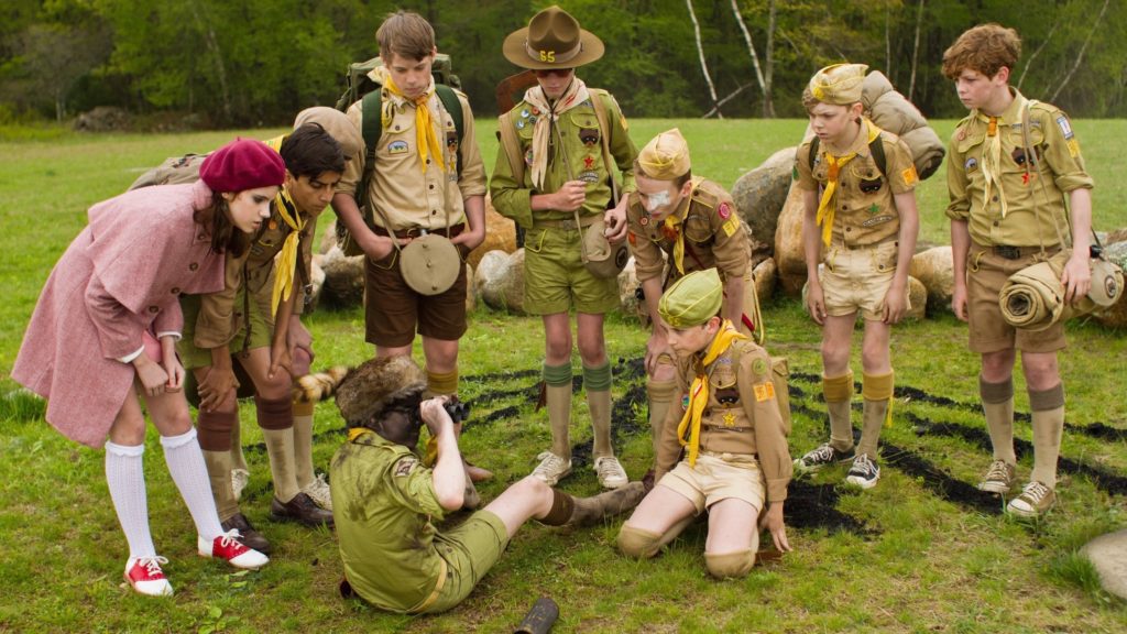
The extreme color harmony, achieved through both grading and set design, creates a sort of heightened sense of reality. In addition, it highlights the runaway young couple’s adventure and youthfulness.
Here is a video that details the LUT and color grading of the film.
No Country for Old Men – 2012
Another classic film that relies on monochromatic color grading. Throughout the film, tans, browns, and yellows dominated the color landscape. This is all done purposefully. Sparsely sprinkled throughout the film are teal elements that balance the oranges.
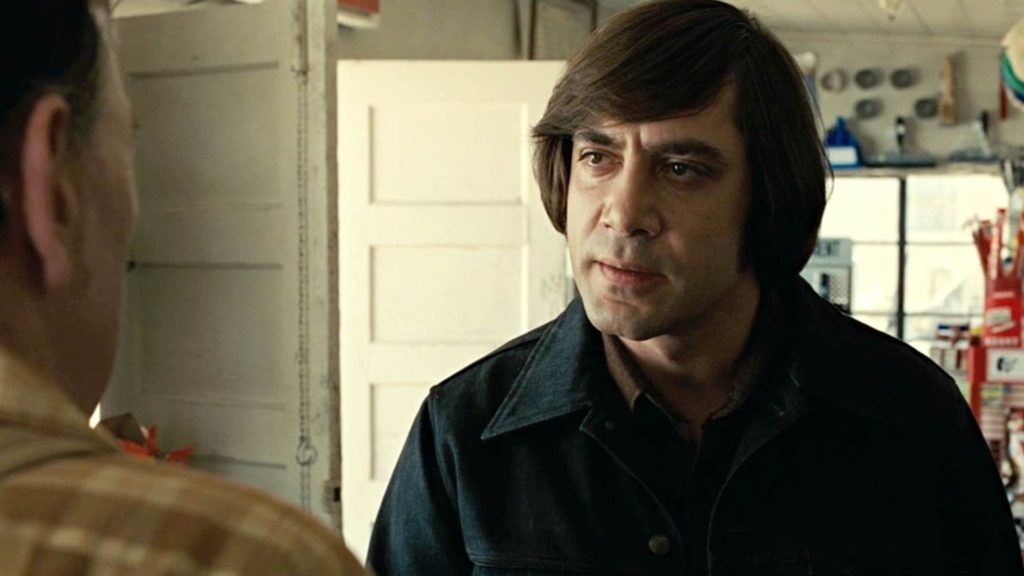
This is an example of paying attention to the details when color grading. While you do not have to be full in on the orange and teal color grade, you can be subtle like the Coen brothers have done in this film.
O Brother Where Art Thou? – 2000
While we are talking about the Coen brothers, it is important to mention this film as it was the first film to utilize all digital color grading. What this means is the process of color grading was done on a computer without chemicals.
The cinematographer Roger Deakins and the Coen brothers wanted the film to have a dry, dusty picture book look. Something we might picture when we think of a Dust Bowl Era.
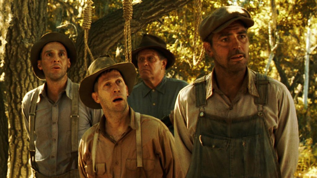
This was all done to place the narrative within the timeframe of the story. The narrative is The Odyssey, by Homer and the timeframe is 1930s south. Again, color grading, concept, and story all go hand in hand.
5 Quick Tips for Better Color Grading
1. Adjust the blacks first
This is also known as lifting the shadows. Bring a little life into the darker areas of your clip to establish the baseline in the exposure. From there, adjust the highlights and midtones before going on to actual color grading.
2. Train Your Eye
Watch films and pay attention to the color grading. Try and determine the decisions around the color of a film. Why were certain choices made? This practice is essential to becoming a better colorist.
3. Balance the skin tones
Most editing and coloring suites will have a way to monitor skin tones. You do not want off-looking skin tones. This tool can be found within the Scopes panel or window. There is often a line that extends from the center where most human skin tones fall. It is important to note that all skin colors fall along this spectrum.
4. Separation beats saturation
When a frame is lacking overall pop or colorfulness, it is easy to boost the saturation. This does not always work. A cinematic solution is to split-tone the image and adjust certain colors. Introduce a little teal into your shadows and orange into the highlights.
Remember, orange and teal represent the highlights and shadows, respectively. This will increase the tonal separation and add depth to the image. Always be subtle when split-toning.
5. Familiarize yourself with LUTs
I mentioned it before, but LUTs are standard across color grading applications. They help normalize footage and can lead to a great baseline. Once you are familiar with them you can start to build your own, this will speed up your workflow and begin to develop your personal style.
Color Grading in Conclusion
With a general understanding of color grading and a few case studies, there are a number of resources out there to get you started.
Adobe Premiere Pro and Final Cut Pro are widely used editing suites that have color grading capabilities. These are the perfect place to start out as a beginner. Both of these programs are also worth staying with for most video production.
For tools that can be used within these platforms, view our list of best color grading software for Adobe, and our list of best color grading software for Final Cut.
DaVinci Resolve has become the standard industry color grading software. It is also free unless you upgrade to the $295 version which has many more features.
Whichever software you choose, be sure to take time and familiarize yourself with the ecosystem. Practice is my go-to advice for anything and with it and time, you can be on your way to becoming a master colorist.